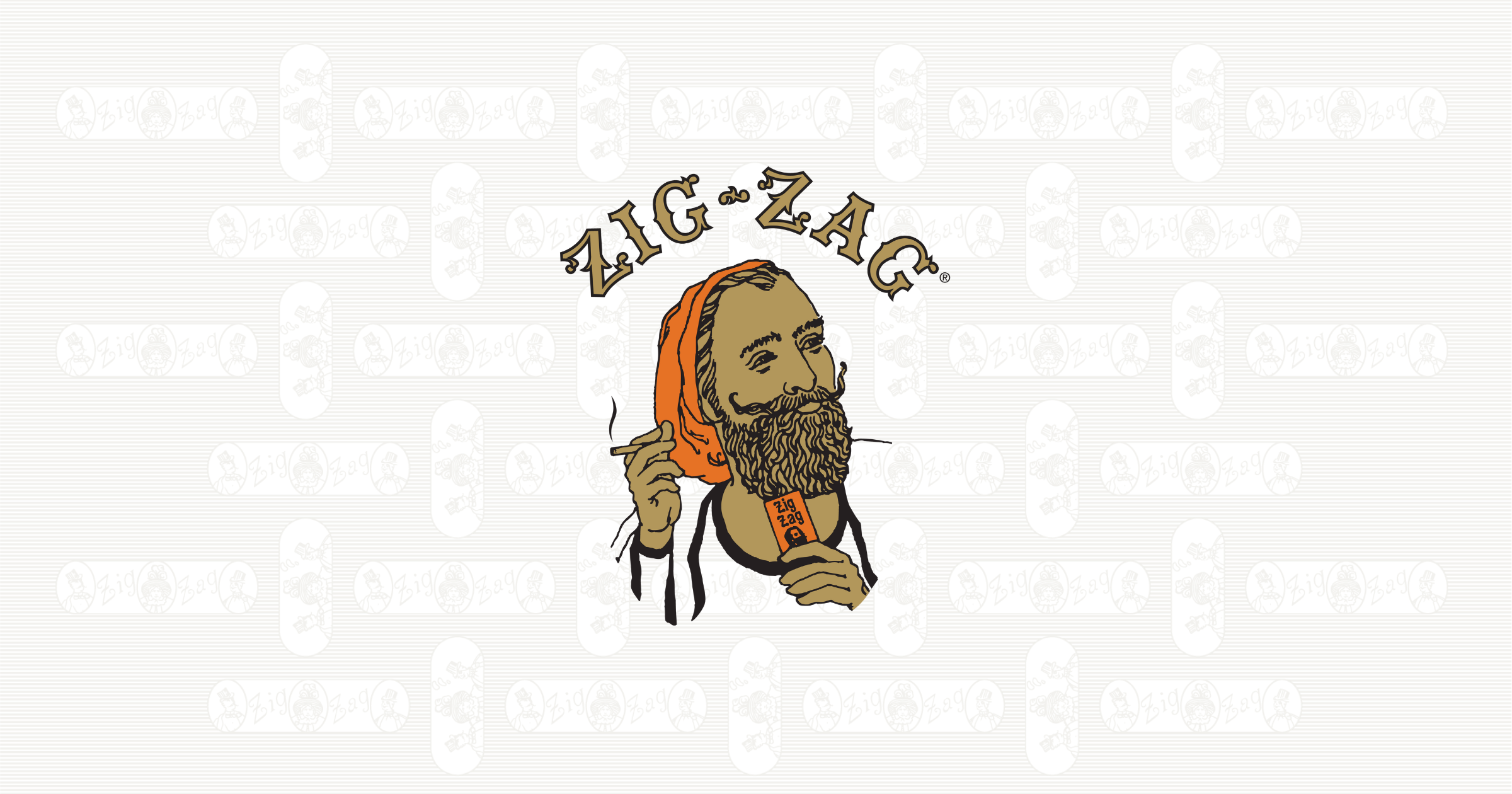
The Evolution of the Iconic Zig Zag Logo
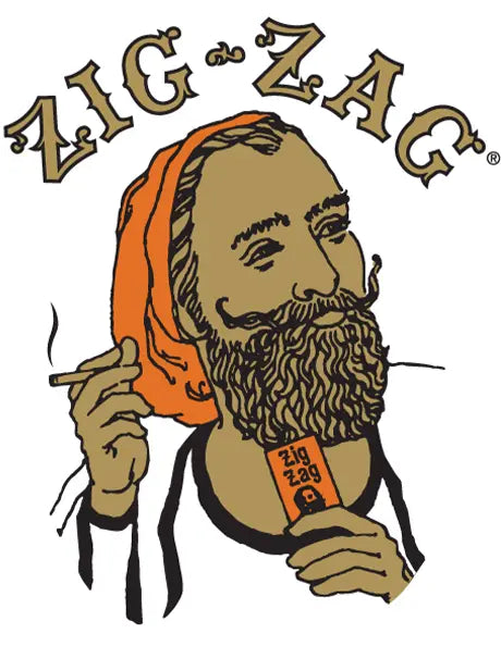
You’ve seen the Zig-Zag man. On papers, posters, album covers, even T-shirts. But how did a sketch of a French soldier turn into one of the most recognizable logos out there? We’re talking 140+ years of culture, design, and consistency. In this blog, we’re looking back at how the Zig Zag logo started, how it changed over time, and why it still hits today.
Origins of the Zig Zag Logo
Zig-Zag didn’t just come out of nowhere. The logo is rooted in real history, dating back to the mid-1800s. It all started with a soldier, a bullet, and some quick thinking.
The original artwork that inspired the logo traces back to the Crimean War in 1855. Legend has it a French soldier (a Zouave, to be exact) had his pipe shattered by a bullet. Undeterred, he tore a piece from his gunpowder bag and rolled his own. That moment of improvisation would go on to shape the image that now lives on every Zig-Zag pack.
Where did Zig-Zag officially begin?
Fast forward to 1879. That’s when French brothers Maurice and Jacques Braunstein opened a paper facility west of Paris called the Papeterie de Gassicourt. Instead of manufacturing full packs from scratch, they processed large paper rolls into ready-to-use rolling papers.
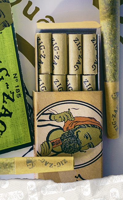
For branding, they went with what worked, a nod to the legendary soldier. Their early packaging featured a hand-drawn sketch of a single smoking Zouave. Simple, strong, and unforgettable. Want to geek out on the full history? Hit up our Explore Zig-Zag History page
A Cultural Touchstone Across Generations
In the early 1900s, Zig-Zag found fans among:
-
Bohemians across Europe who embraced non-mainstream art and design
-
Musicians and street performers who carried Zig-Zag packs in their pockets and guitar cases
-
Independent printers and zine creators who appreciated strong, standout visuals
Back then, the logo wasn’t flashy, but it was bold. People connected with the look and the story behind it.
A major moment in hip-hop history
Let’s talk about The Chronic, Dr. Dre’s 1992 solo debut. Triple platinum. Grammy-winning. A defining moment in West Coast rap. And front and center on the cover? A gold oval framing Dre’s face, styled exactly like the Zig-Zag logo.
That wasn’t some random art choice. It was a clear reference. That cover became one of the most recognizable in hip-hop. And with it, the Zig-Zag logo reached a new generation.
The logo as a style symbol
As the years went on, the Zig-Zag man started showing up on more than just paper packs:
-
Bootleg T-shirts and merch
-
Posters at underground shows and skate events
-
DIY fashion pieces and custom jackets
-
Collabs with emerging streetwear designers
Our logo has been around longer than most trends and outlasted plenty of brands. We keep it fresh without losing what made it work in the first place. That’s why our current rolling paper collection still features that iconic artwork on the classics.
Redesigns and Subtle Shifts Over the Years
So what’s changed in the Zig Zag logo over the years? Let’s get into the visual stuff. The Zig Zag logo you see today isn’t exactly the same as the one from 1894, but it’s close. That’s kind of the point. We’ve kept the core look sharp while making small updates that fit the times.
The Zig-Zag man has stayed front and center. But the way he’s been framed, shaded, and outlined? That’s evolved. We’re not into full-blown redesigns. Instead, it’s all about tweaking the details to keep things tight. Some of the visual changes over the years:
-
Color tweaks: Slight adjustments to the red and gold tones to match print trends
-
Line work updates: Cleaner outlines and modernized shading while keeping the classic profile intact
-
Typography changes: The Zig-Zag name has gone through a few font shifts, but it’s always bold, always easy to spot
-
Packaging layouts: Different placements of the logo across paper booklets, tubes, and wraps while still giving it hero status
Holding onto the classics
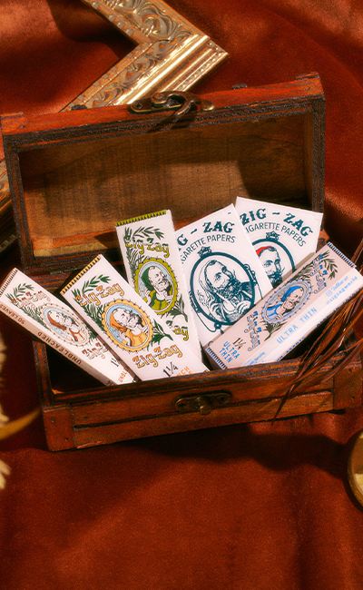
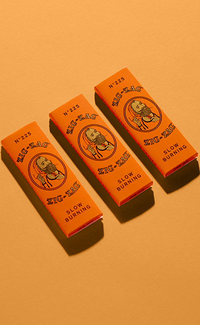
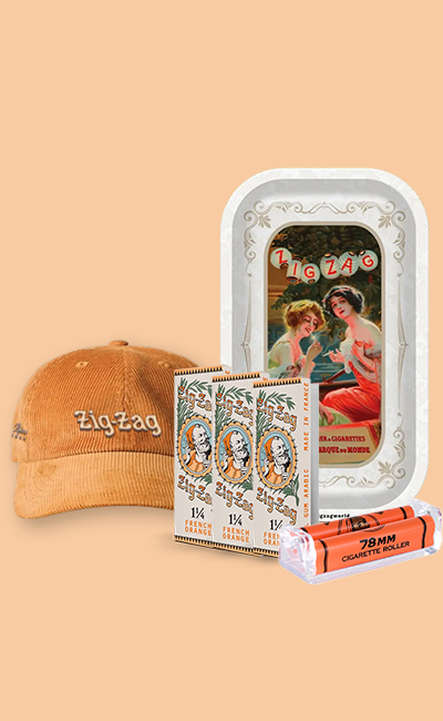
Some things just work. That’s why you’ll still find our original style on staples like the Vintage French Orange 1 1/4. It’s that classic combo of the Zouave, the frame, and the bold type.
The logo’s changes aren’t just cosmetic. They also help it look clean across different formats:
-
Print and packaging
-
Digital and mobile
-
Merch and apparel
-
Collaborations with artists and designers
The Logo in Pop Culture and Fashion
The Zig-Zag man’s face has made the rounds—music, fashion, posters, and way beyond. He’s part of the culture. You’ve seen it. Probably more times than you even realize.
In music and album art
We already mentioned The Chronic, but that wasn’t a one-off. Since then, the Zig-Zag look has become a recurring theme in music. DJs, producers, and underground artists have referenced it on:
-
Album covers
-
Event flyers
-
Tour merch
-
Limited-run vinyl sleeves
On clothing and custom pieces
We’ve seen it bootlegged, flipped, reprinted, and reworked on everything from oversized tees to denim jackets. Creatives have used the Zig-Zag logo as:
-
A badge for independent thinking
-
A style statement that nods to old-school cool
-
A reference point for retro design that doesn’t feel outdated
And while the bootlegs are everywhere, you can also grab official Zig-Zag apparel that nods back to the vintage look. The clean lines and old-school colors still hit.
What the Logo Represents Today
For a lot of people, the Zig Zag logo is a symbol that means you do things your way. You’re here for quality and history that backs it up. Today, the logo represents:
-
Independence: because we’ve been standing alone since 1879
-
Authenticity: nothing manufactured, just something that stuck
-
Creativity: the same energy that started it all back in France
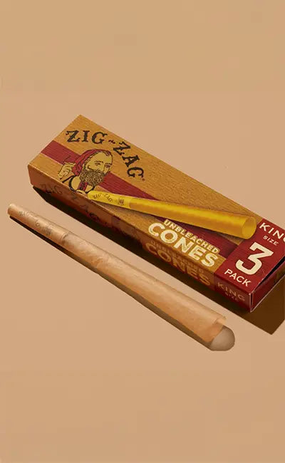
You’ll find that energy in everything we put out, from our cones to our wraps and rolls. The packaging might shift, but the meaning doesn’t.
Conclusion
Some logos fade. Ours hasn’t. Over 140 years later, the Zig-Zag man still holds weight. He’s on shelves, in closets, and across generations. People know the logo. People trust the logo. And most of all, they respect what it stands for.
You don’t need to know the full history to feel what the logo represents. But now that you do, it probably makes a little more sense why people keep it in their rotation. From Paris in the 1800s to streetwear in LA—Zig-Zag hasn’t missed a beat.
And if you’re into the original look, you can still get that classic feel with the Zig-Zag Vintage White. It’s the same trusted paper, now wrapped in collectible vintage packaging that pays tribute to where it all began.
